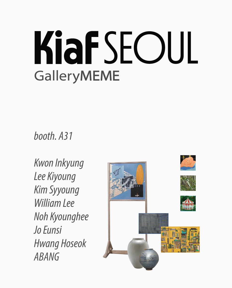
이상협
M’VOID is a program that plans and presents exhibitions of leading artists at home and abroad who question contemporary aesthetic values while strengthening their works with insights.
ABOUT
이상협은 영국에서 17년 동안 학업과 작품활동을 하면서 한국적 미감을 찾기 위해 도자 공부를 병행하며 우리의 고유한 형태를 실험해 왔다. 귀국 후 다양한 작품 활동을 통해 동시대성과 맞물린 전통의 멋을 찾아가고 있다. 금속이라는 차가운 물성으로 인간의 감성과 자연의 변화처럼 흘러내리고, 녹아내리고, 때로는 휩쓸리는 듯한 질감을 표현해 낸다. 무게 11kg에 두께 5.5cm 한 장짜리 은판을 망치로 두드리는 판금기법으로 제작한 직경 50cm가 넘는 거대한 달항아리는 강하면서 부드럽고 우직하면서 섬세하다. 2023년 올해의 공예상을 수상했고, 2022년 KCDF 공예디자인공모전시 개인작가 부분에 선정됐다.
“아름다움에의 흠모는 - 도덕, 사실, 유용성, 감각,
그리고 되도록 현실 그 자체로부터 멀리 - 위험할 정도로 이들보다 우선한다.”¹
1. 장인의 작업(作業)
흑자와 은기는 분류상 공예(工藝)에 속한다. 이러한 분류가 요즈음 무의미하지만 그렇더라도 필자가 이야기하려 할 두 장인, 김시영은 도자공예가를 줄여 도예가로, 이상협은 금속을 다루기에 금속공예가지만 그냥 줄여 공예가로 호칭하는 것이 이들을 ‘작가’라 부르기보다 낫다고 생각한다. 우리의 장인적 유대감이 강한 공예의 전통이 반영된 - ‘artist(작가)’라 통용되는 서구 모더니즘의 영향이 조금은 덜 묻어나오는 - 언어인 것 같기 때문이다.
공예는 기본적으로 재료에 천착(穿鑿)한 노동집약적 작업이다. 필자가 화두(話頭)처럼 던진 “아름다움에의 흠모”는 그 다음의 일이다. 그런데 공예 또는 미술과 관련하여 우리가 사용하는 용어의 대부분은 옛날부터 사용하던 한자어(漢字語)이거나 아니면 한자어에 기반한 일본식의 표기를 따른 것이다. 한 예로 공예의 장인정신과 직결되는, 흔히 쓰는 ‘작업(作業)’이란 언어를 살펴보자.
‘작업’이란 한자어의 의미를 우리말로 풀어쓰면 무언가를 ‘만드는 일’쯤 되지만, 이 말이 함축하는 뉘앙스의 범위는 한층 깊고 넓다. ‘업(業)’이란 어찌 보면 그냥 우리의 ‘생활(life)’ 그 자체를 의미한다 해도 틀린 말이 아니다. 우선, ‘업’이라 하면 ‘일’이란 언어가 먼저 떠오르는데 이것은 우리의 몸과 사고와 직결되는 ‘노동’을 뜻한다. “몸과 사고의 노동”은 곧 우리의 ‘직업’과 ‘생계’로 이어진다. ‘업’을 실행한다는 것은 그것이 곧 우리의 ‘생활’일진대, 그것은 필연적으로 종교와 윤리 같은 무언가 ‘근원, 기초, 시작’과 연루된 사회적 함축성을 띨 수밖에 없다. 때문에 ‘업보(業報)’ 혹은 ‘인과응보(因果應報)’의 뜻을 품고 있으니, “몸과 입과 뜻으로 짓는 선악의 소행”이 곧 ‘업 (業)’인 것이다.
이 말의 뜻을 길게 늘어놓는 이유는 김시영과 이상협은 ‘작가’이기 이전에 기본적으로 공예의 행위와 사고를 ‘일’ 즉 ‘노동’으로 받아들여, 그 행위를 통해 자신의 ‘직업’을 표방하고, 그 직업을 통해 자신과 가족의 ‘생계’를 이어간다는 의미를 품고 있기 때문이다. 즉 김시영과 이상협이라는 전업공예가로서의 ‘당당함’이 ‘작업’이라는 단순한 용어 속에 함축되어 있을 뿐만 아니라, ‘업보(業報)’처럼 다가온, 주어진, 선택한 공예가로서의 고뇌와 환희의 ‘생생함’이 곧 ‘작업’인 셈이다. 이러한 작업의 속성이 생산해낸 결과물은 또 다른 차원의 문제이나, 사회의 현실은 ‘과정’보다는 ‘결과’를 앞세워 유통과 가치의 ‘상품성’에 치중하는 자본주의적 모순을 안고 있다. ‘작품’이라 일컬어지는 결과물이 가질법한 그 과정으로서의 진정성의 농도와 미학적인 평가는 작가를 떠나 관람자가 개입하는 또 다른 범주의 문제인 것이다.
2. 김시영의 흑자(黑磁)
근자(近者)에 이르러 단색화의 재유행과 함께 단색화류의 추상을 공예도 추구한다. 좀 더 구체적으로 ‘달항아리’가 한국인의 미감을 대표하는 ‘미적(美的)’ 오브제로 부각(浮刻)하면서, 전통과 맞물린 추상성의 재현을 공예로 따라 하는 경향이 생겼다는 이야기다. 그 경향과 함께 공예는 공예의 태생적인 기능(器能)과 멀어지면서 흔히 우리가 미술의 주류라 일컫는 회화와 조각의 개념과 미학, 장식성을 덩달아 추구하기 시작하면서 ‘작가’라는 호칭으로 이들 두 장인을 편하게 부른다.
시대가 변했다 하더라도 공예의 순기능이 우리 일상생활과 함께 아름다움을 이야기해야 한다는 것이 필자의 지론이다. 쉽게 말하자면 그림은 벽에 안 걸어도 먹고사는 데 지장이 없지만, 그릇은 당장 먹는 데 없어서는 안될 필요충분조건의 기물이다. 필자보고 무식한 소리라 하겠지만 그만큼 공예의 태생적인 순기능이 약화되고 있는 느낌이 안타까워 한마디 적었다.
단색화의 재유행이 불러온 ‘이조백자’의 미감도 어찌 보면 유교적 도덕성의 시지각에 갇힌 우리 전통의 연장선상에 있다 하겠다. 전통의 재현은 복제(複製)를 넘어 그 시대 정신이 깃든 재현이되 ‘변형(transformation)’의 무엇이어야 한다. 공예의 순기능과 아름다움의 척도는 바로 이 변형된 무엇에 깃든 무엇이라 하겠다.
김시영의 흑자도 단색화의 미감으로부터 자유롭지 못하다. 왜냐하면 단색이기 때문에.²그런데 김시영은 검정색의 톤은 유지하면서 ‘항아리’라는 순기능의 형태를 무시한, 그야말로 자유롭게 조각적 느낌이 강한 볼륨(volume)과 매스(mass)의 ‘덩어리’ 개념으로의 변형을 꾀하고 있다. 포스트모던의 시대 정신?, 아니면 작업과 형식의 단조로움에 따른 일탈(逸脫)의 변형? 아니면 와일드 (Oscar Wilde) 식의 “위험할 정도로” 추종하는 “아름다움에의 흠모”? 김시영의 변화는 매우 흥미롭다. 그의 다음이, 차제에 검정색도...
3. 이상협의 은기(銀器)
‘달항아리’의 재료는 ‘은판(銀板)’이다. 말 그대로 은으로 된 널찍한 판을 두드려(단조 鍛造) 항아리를 만들고, 만든 항아리의 색(色)과 형태가 달을 닮아 순수한 우리말로 ‘달항아리’라 불린다.
은(銀 silver)은 하얗다. 해서 백은(白銀)이라 불리기도 한다. 은은 다른 금속에 비해 무르기 때문에 단조에 유리하다. 또한 표면에 들어오는 빛의 대부분을 반사해 금속 중에서 광택이 가장 강하다. 이러한 속성으로 말미암아 동서양은 고대로부터 은을 귀중하게 취급했고, 그 은은한 빛깔 때문에 ‘달’과 관련한 상징과 신화로 자주 등장한다. 이러한 재질의 탁월한 가치는 고대로부터 통용되어 종교용의 제기(祭器)나 상류사회의 일상 용기를 제공하는 공예의 고급재료로 사용되었으며, 특히 16세기 이후 영국을 비롯한 유럽인들 사이에 떠도는 은그릇의 명성은 오늘날까지 이어져 내려온다. 때문에 영국에서 먼저 작가로서의 명성을 획득한 이상협의 작품 저변에는 이러한 역사성이 깃들어 있다 하겠다.
은(銀)은 한때 금(金)보다 더 대접을 받았었다. 그래서인지 ‘돈(화폐)’의 저장고인 은행(銀行)을 ‘금행(金行)’이라 부르지 않나 보다. 은행(銀行)이란 한자어의 어원은 중국이다. 한때 은본위제 국가였던 중국의 영향으로 우리도 은을 화폐로 사용했듯이 ‘은행’이라는 말은 은의 유통에서 비롯되었다. ‘항아리’를 만들 여러 재료가 있을 수 있겠으나, 예를 들어 그림과 사진 또는 영상 등도 매체로서의 동등한 등가관계로 금속과 비견(比肩)할지언정 은의 상징과 가치가 그러하듯, 이상협은 노동과 조형 차원 이전에 매우 비싸고 좋은 재료를 점유함으로써 일단 한 수 접고 ‘메인(main)’ ‘게임(game)’에 임하는 것과 다를 바 없다.
이상협은 “flow, 흐름, 흘러내림, 얼어붙음, 녹아내림 등 자연의 유기적인 현상에서 (작품의) 영감”을 얻었다 한다. 이 영감의 발현은 조형적으로, 또는 형식적으로 ‘달항아리’라 불리는 은기의 표면에 나타나는 질감의 재현적인 표현과 매우 닮아있다. 물론 무수한 노동의 망치질 가운데 몸과 정신이 일치하는 무아의 몰입감도 있었을 테지만, 어쨌든 그 질감은 타격의 힘(에너지)을 조절하는 가운데 우연히 생성되는, 때로는 의식적으로 생성한 추상적인 질감에 불과하다. 그런데 이런 추상적인 질감의 부분과 전체의 표피가 관람자에게 매우 매혹적으로 다가와 그 자체만으로도 만져보고 싶은 촉각적인 충동을 불러일으키기도 한다. 거기에 덧붙여 기억에 의한 우리의 시지각은 무언가를 연상해내어 마치 무언가 ‘흐르는’ 듯한 정서와 맞닥뜨려 시공간을 초월한 각자 나름대로의 재현적인 일상으로 우리의 상상을 이끌어간다.
때문에 ‘달항아리’의 매력은 다음의 두 성격으로 집약된다. 첫 번째, ‘달’과 ‘항아리’의 결합이 불러일으키는 과거지향적인 정서와 두 번째는 ‘추상(성)’과 관련한 현대미술의 정서로 풀이할 수 있겠다. 또한 이 둘의 성격은 결국 모여져 ‘단색화’와 관계되는 형식적인, 미학적인 논의들과 맞물려있다는 것이 필자의 관점이다. 왜냐하면 최근 일고 있는 ‘단색화’에 대한 복고적 취향의 미술시장성 역시 이들 논의의 틀과 결합되어 있기 때문이다. 그러나 앞서 밝혔듯이 변형의 관점에서 ‘은(銀)’을 떠난 이상협을 상상할 수 있을까?
필자는 이번 전시의 기획을 ‘흑과 백’의 단색조에 맞춘 두 공예가의 작품이라 생각한다. 물론 재질은 달라도 거기서 흘러나오는 단색조의 미감은 서로를 떠받쳐주는 정반합의 어울림이 있을 것이기 때문에 관람자에게도 ‘나의 아저씨’ 같은 두 작가가 풍기는 은은하지만 듬직한 매력을 작품에서 느낄 수 있을 것이다.
[1] Oscar Wilde, The Critic as Artist, New York: David Zwirner Books, 2029, p. 13: “the worship of beauty takes precedence, dangerously, over morality, facts, usefulness, sense, and, as far as possible, reality itself.”
[2] 이것은 라우센버그(Robert Rauschenberg)의
정영목 (서울대학교 명예교수)
“The worship of beauty takes precedence, dangerously, over morality, facts, usefulness, sense, and, as far as possible, reality itself.”[1]
1. Master’s ‘Work’ (作業)
Both black ceramics and silver object are classified as craft. While such a classification has lost its meaning in this age and time, I believe that the labels of ‘ceramist’ and ‘metalsmith’ serve Kim Syyoung and William Lee, respectively, better than the generic term ‘artist’. For, the labels, I insist, not only show less influence from the Western modernism that calls everyone ‘artists’ but also reflect our tradition in craft that denotes a connotation of ‘artisan’ or ‘meister’.
Craft is essentially a labor-intensive work that penetrates the essence of the material. “The worship of beauty”, quoted above, is merely what follows. Most of the terms related to craft or art come from borrowed words from Chinese or follow Japanese orthography based on Chinese letters. For example, let us take a look at the word 作業 which is directly connected to the idea of craftsmanship.
If we are to directly translate the Chinese word 作業 into Korean, we could perhaps say ‘to make things’; there are, of course, deeper and wider connotations to the nuance of this word. The letter 業 might as well be translated to ‘life’ itself given its uses in Chinese language. And indeed, the most common association that Korean speakers have with the word 業 would be ‘work’. Here, ‘work’ signifies a sense of labor that employs both our body and our mind. A ‘labor of body and mind’, then, connects to our ‘occupation’ and the act of ‘making a living’. To act on ‘業’, therefore, marks the beginning of our ‘life’ and is inevitably connected to the notions of ‘origin, basis, or beginning’, of which societal implications bear resemblance to religion or ethics. As we see in examples of ‘業報’ (roughly, Karma) or ‘因果應報’ (roughly, a just punishment or recompense), ‘業’ constitutes a sense of the struggle between right and wrong, and good and bad.
This etymological divergence is to emphasize how Kim Syyoung and William Lee take the actions and thoughts of craft as ‘work’ (and hence ‘labor’) before declaring any occupational or vocational connection to being ‘artists’. That is to say, these two masters assert their ‘occupation’ not through obtaining a degree, for example, but by committing to their ‘job’ and by ‘making a living’ for themselves and their families. Simplified, not only is the confidence of these two professional craftspeople imbued into the word of ‘作業’, but also the consciously chosen ‘vividness’ of both anguish and euphoria as craftspeople that equate ‘業報’ (karma) eventually become their ‘works’. While such properties of their artistic endeavor lead to the production of works that belong to a wholly artistic realm, it is a shame that ‘reality’, with its capitalistic irony, prioritizes ‘result’ over ‘process’ and hence values ‘marketability’ of the work. That is to say that the problem of aesthetic judgment and evaluation of the artistic commitment to their ‘works’ is not solely in the hands of the artists but at the mercy of the audience.
2. Kim Syyoung’s Black Ceramics
Recently, craft, too, pursues the abstract that we find in monochrome painting following its resurgence. More specifically, as the ‘moon jar’ located itself as the iconic aesthetic objet that represents South Korea, craft began to exhibit a tendency to represent the abstract in connection to its tradition. With such a tendency, craft was distanced from its inherent function and started pursuing concepts of painting and sculpture (what we consider to be the two mainstream genres of art), aesthetics, and decorativeness, eventually leading to the point where we are comfortable calling these two masters ‘artists’.
It is my contention that craft’s function remains the same despite the change in the epoch, and that its everyday-life-ness must be discussed along with its beauty. In other words, one does not need a painting on a wall to be able to sustain one’s life, but a plate is a necessary condition for one to sustain a human life. Some might dismiss my view on the basis that craft, too, is gratuitous for the sustenance of life, but the point that I am raising here is that craft’s inherent functions are increasingly blurred these days.
The aesthetic of ‘李朝’ white porcelain (李朝 is an archaic term for Joseon), made popular again by the recent resurgence of the monochrome painting, can be said to be the extension of our tradition that is unfortunately trapped within the Confucian ethics and its perceptive limits. The representation of the tradition should be a kind of representation that, transcending beyond mere mimesis, steps into the realm of ‘transformation’ that carries its zeitgeist. The criteria with which we assess craft’s functionality and beauty should, so I argue, pertain to that realm of ‘transformation’.
Kim Syyoung’s black ceramics works, too, are not free from the aesthetic of monochrome painting, as they employ a black monochrome[2]. However, Kim Syyoung’s ceramics works aim at a transformation as a sculptural lump of volume and mass without paying respect to the functionality of a ‘jar’ while maintaining the black tone. How are we to make of this unique transformation? A postmodern zeitgeist? Or an aberration that defies the monotony of work process and form? Or a dangerous worship of beauty as Oscar Wilde explains? In any event, Kim Syyoung’s transformation is scintillating. It draws attention to not only her next project but also to the configuration of black monochrome.
3. Silver object by William Lee
The ingredient for the ‘moon jar’ is a ‘silver plate’. By forging a flat, literal silver plate, the metalsmith crafts a jar. The color and form of the jar resemble the moon, thus giving it its name.
Silver is white. This is why we sometimes call it ‘白銀’ (literally ‘white silver’). Silver is softer than other metals which makes it an excellent ingredient for forging. And because of its surface that reflects most of the light, it shines the brightest among metal. Such properties have put silver on a pedestal in both the East and the West. Its shiny surface, moreover, has associated silver with the Moon, thus recurring in symbols or myths related to it. The value of the material has been recognized from as early as ancient times when plates for religious rituals or upper-class cutlery preferred silver as its ‘fancy’ ingredient. Europeans, in particular the 16th-century England, have put so much value on well-crafted silverware that they are considered antique now. For William Lee whose critical acclaim began in England and not his native Korea, such history can be particularly meaningful.
Silver (銀) was more valuable than gold (金) at times. I believe that’s why we call banks ‘銀行’ and not ‘金行’. The etymology of the Chinese word for bank (銀行) comes from the time of the silver standard. There can be many ingredients to craft a ‘jar’. For example, even painting, photography, or videography can be used, in this age of abstract art, to create an image of a jar as efficiently as metal. However, as the symbol and value of silver suggest, one can argue that William Lee has taken the initiative on a pricey yet valuable material to start his main game more luxuriously.
William Lee says to have been inspired by the natural, organic phenomena such as “flowing, melting, or freezing”. The manifestation of such inspiration resembles, both formally and stylistically, the representations of textures appearing on the surface of the ‘moon jar’. While it is evident that the metalsmith must have been immersed with both his body and mind during the restless hammering of the plate, the texture that appears on the surface is a product of accident that takes place in the random strikes with varying degrees of strength. However, it is the randomness and the abstraction of the part of the texture (and the entire surface that is a series of such textures) that makes the audience want to feel and touch the ‘jar’. In addition, our visual perception will associate the surface with the sentiment of ‘flowing’ that, in turn, creates a reproduction of one’s life that transcends spatiotemporal boundaries and leads our imagination.
In this sense, the appeal of ‘moon jar’ is twofold. One, the past-oriented sentiment that the mixture of ‘Moon’ and ‘jar’ creates, and two, the sentiment of contemporary art related to abstraction. It is my contention that such characteristics of the ‘moon jar’ will eventually converge and create discourses related to the formal and aesthetic discussion of the monochrome painting. This is also noticeable in the retro taste of the contemporary art scene that focuses on monochrome painting. At the same time, can we imagine William Lee without silver as his main material and main element for the ‘transformation’ as I discussed earlier?
I see the project of this exhibition as a convergence of two master craftspeople whose colors of ‘black and white’ are contrasted. While they might use different materials, the monochrome aesthetic that these materials emanate shows a dialectic harmony between them. The audience will surely feel the subtle yet certain attraction of the works that these two masters pronounce.
[2] I am speaking of my argument from elsewhere that Black Painting by Robert Rauschenberg is not unrelated to the monochrome paintings of Japan and Korea. Kim Syyoung’s Black Ceramic works pertain to this argument.
Jeong Young Mok (Professor Emeritus, SNU)